Make it stand out.
Presenting an idea is only effective when they can visualize the idea. Promotional Material takes complex topics that can be presented for hours and places it all on one page.
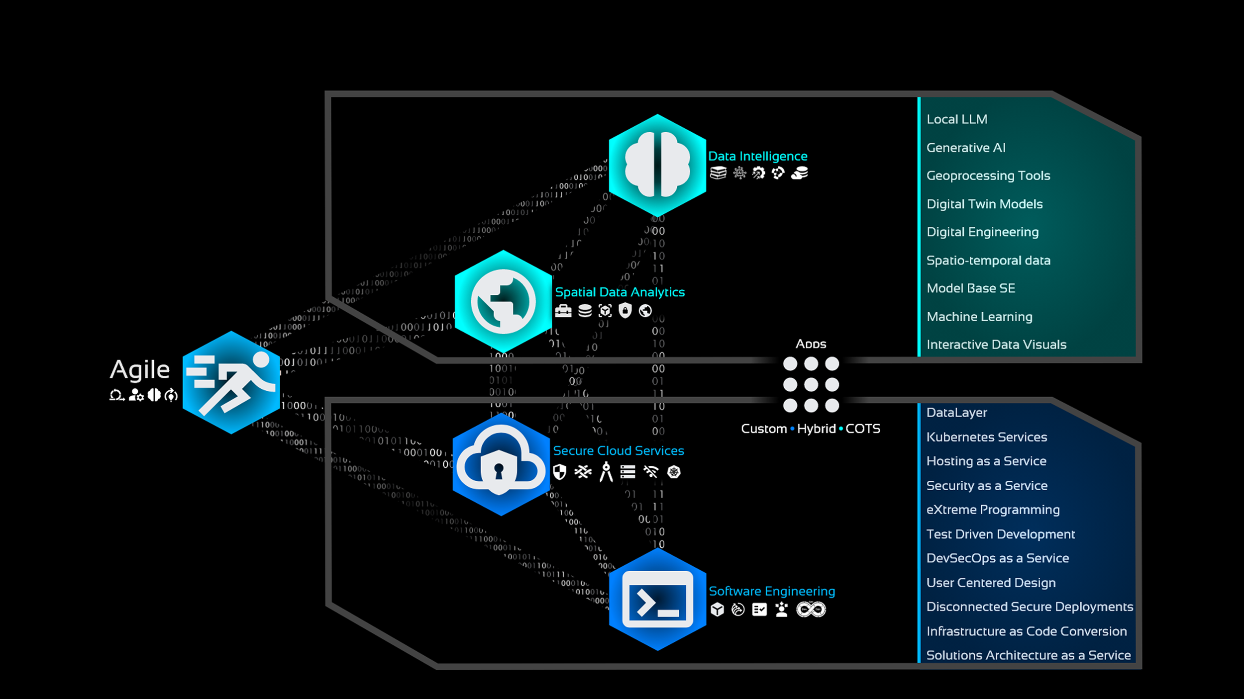
This is a slide from a presentation that I created showcasing the many capabilities of our team and how they interact in a simple image.

This is perhaps the image that started my UI/UX career. I took the complex idea of GIS, BIM, and PLM and conveyed how they overlap and contribute to the massive project that is Sentinel ICBMs. This was used in countless presentations and started the buzz in the company that I was more than just a GIS guy.

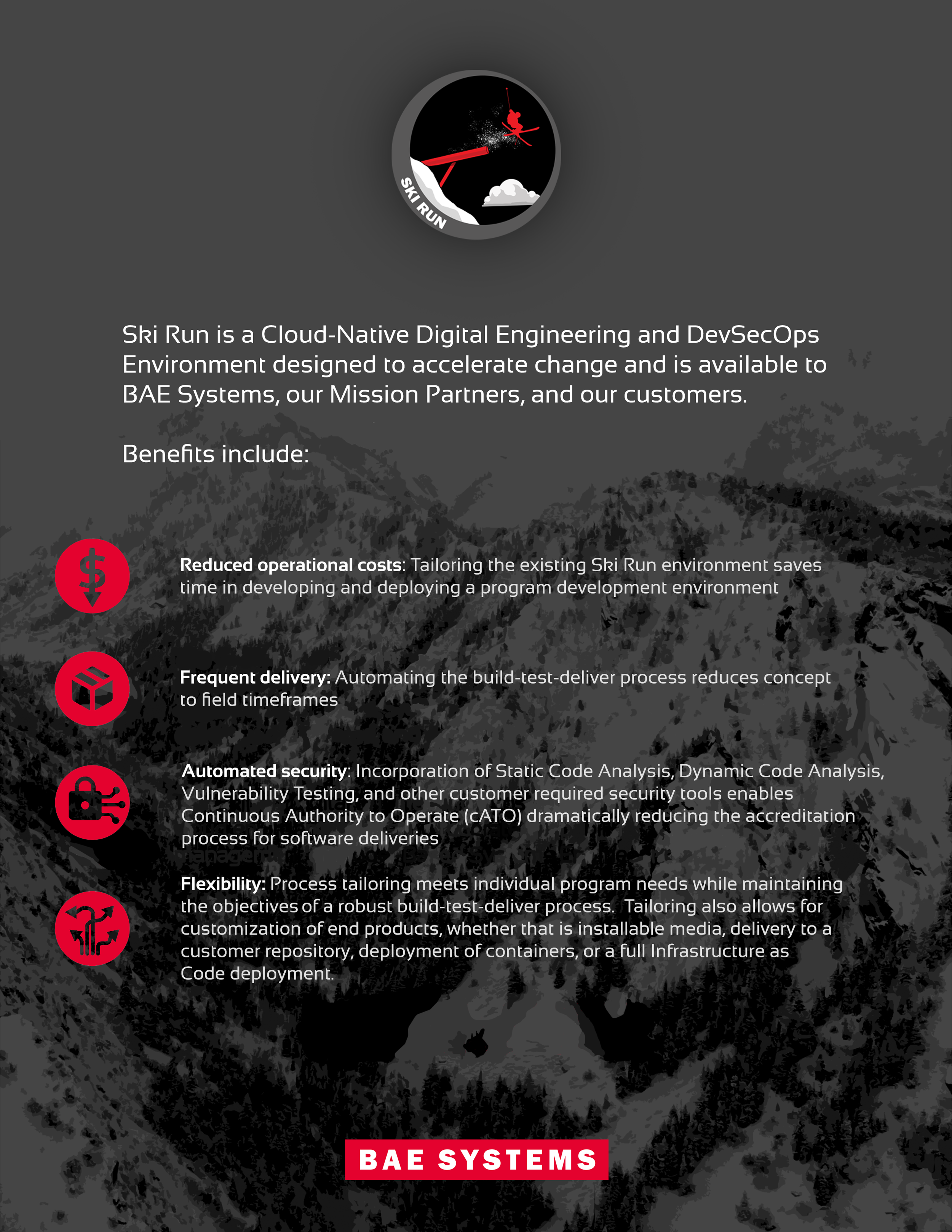
This is a slide from a presentation I created to promote our capabilities. I enjoyed creating the subtle elements that I put in the image like the skirun logo and the company logo reflected in the goggles.
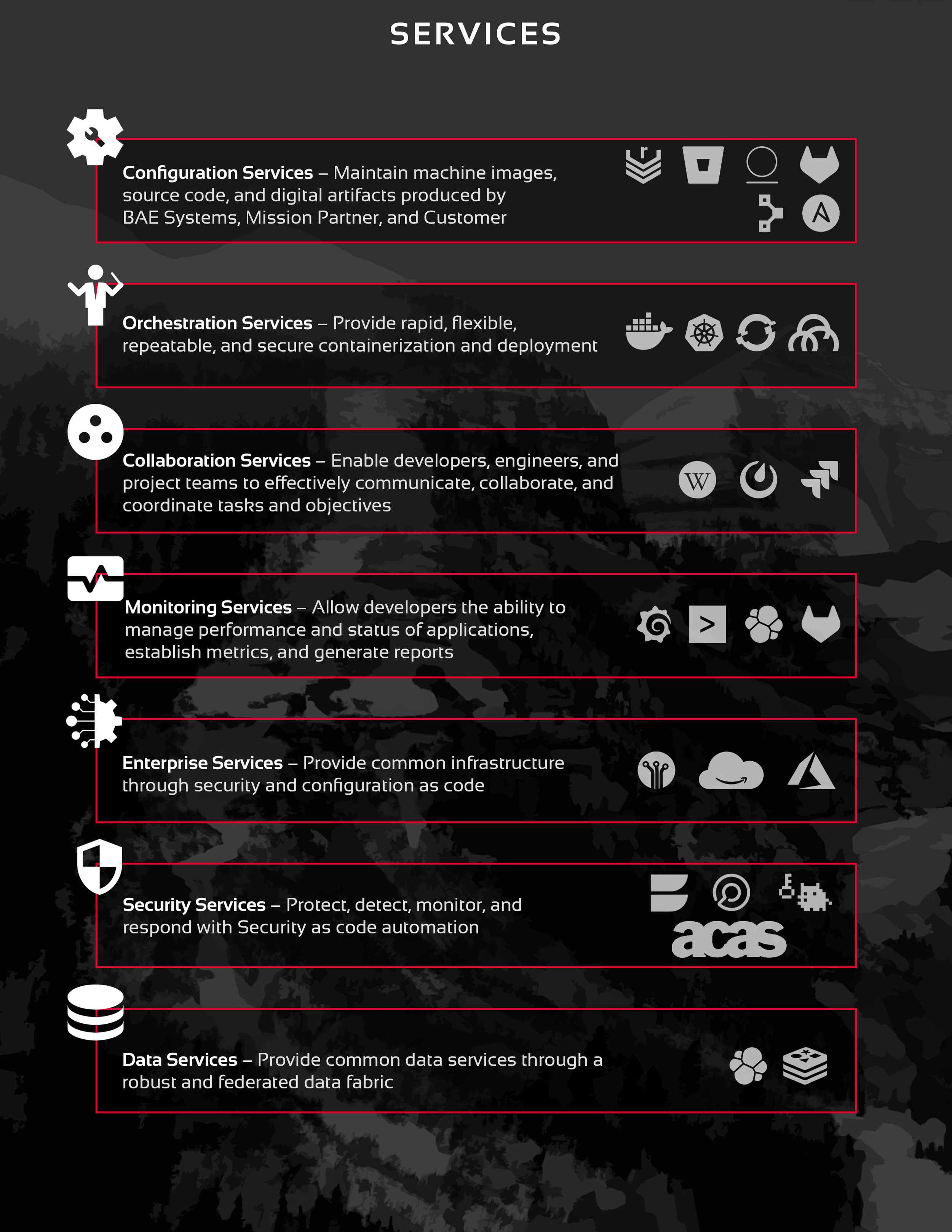
Here is page 1 of 4 of our slicksheet. There was a lot of data to convey in these 4 pages. I really enjoyed the process of organizing and displaying all this information in a format that keeps the reader engaged but also want to ski.
Page 2 of 4. I liked the hidden element of a single combined image in the background when placing page 2 and 3 side by side.

Page 3 of 4. Much work was even put into the background imagery. I wanted it to be interesting but not detract from the important information. It needed to be simplified but still engaging.