Clear and Concise
UI design is a process of organizing all the customers thoughts and wants into a simple, inviting, and intuitive design.

The AVCOM app was a victim of 20 years of scope creep and cognitive overload. The customer became fed up with the app's UI and threatened to end the contract. As a result, I was brought in to overhaul the front end. The result is a modern, simplified UI that is intuitive and breaks down complex data into a simple interface.

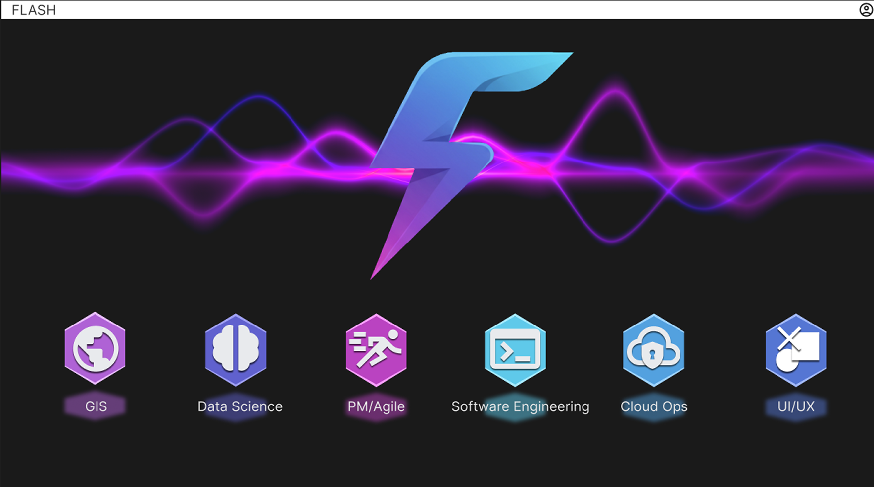
Flash was an internal project to create a hub for Knowledge Management and Knowledge Transfer (KMKT). This is the landing page that I designed to be simple and eye catching with straightforward navigation so the user doesn't waste time in the wrong subject.

Stance is one of my most recent projects that combines tasks and risks for a project. It's set up to be intuitive and clickable so the user can easily drill down to details of the biggest risks or tasks with the most or biggest risks to avoid projects getting behind in cost or schedule.

Hopper is a collaboration with data scientists who created a core capability for the customer to avoid unacceptable risks.

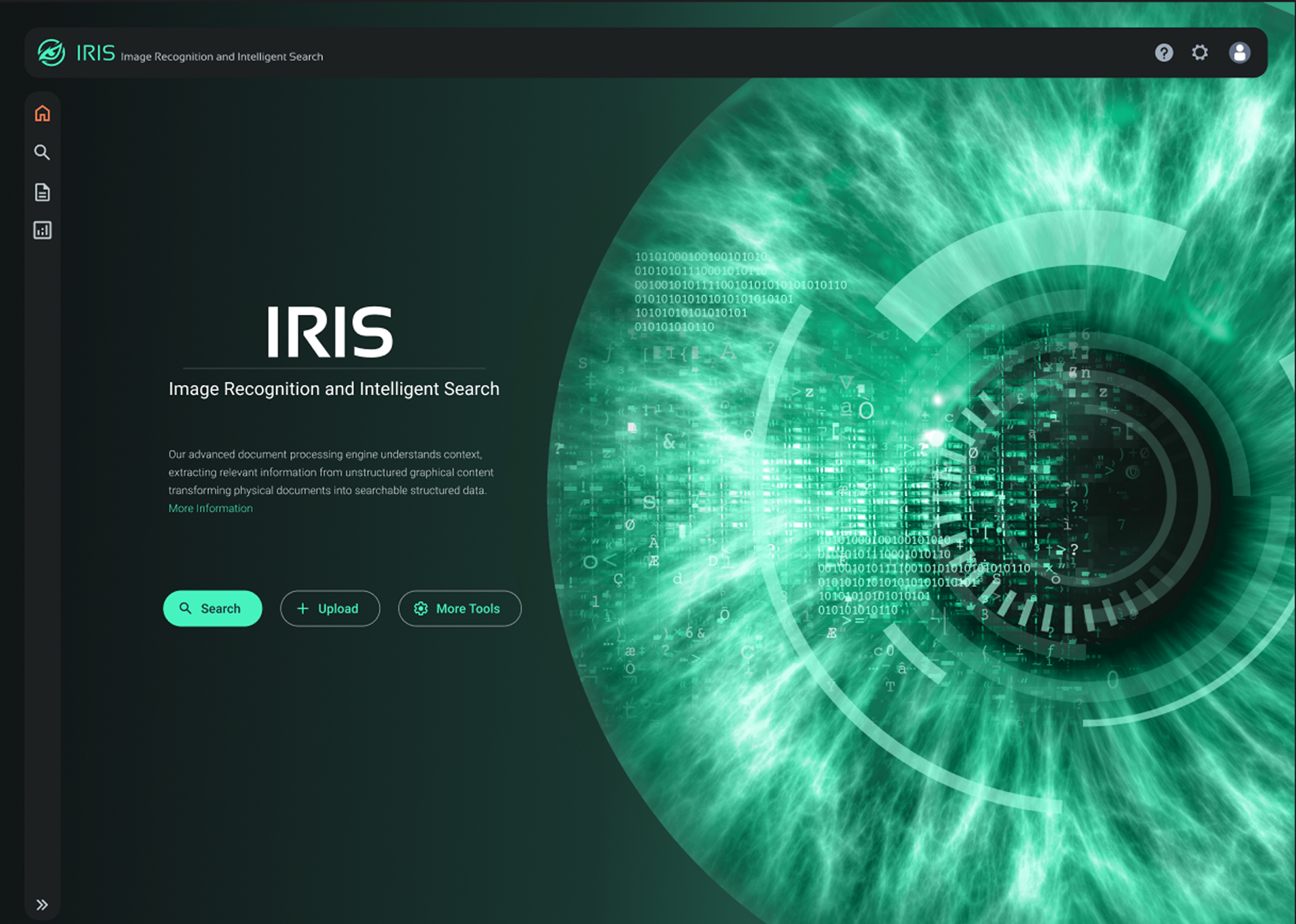
IRIS was another collaboration with data scientists and is meant to mimic the look and user flow of Hopper. This project was a huge success because I was able to hold design reviews with all members of the team to get diverse feedback. The team consisted of myself, a developer, a data scientist, and a project manager.

This app was created to replace static pdfs of the daily rhythm in the field. It hosted real-time data with categorized data to give the most information possible in an easily digestible format.

ICBM Insights was the first and most impactful app in my current role. It married my love of GIS and UI/UX into a robust and powerful capability.

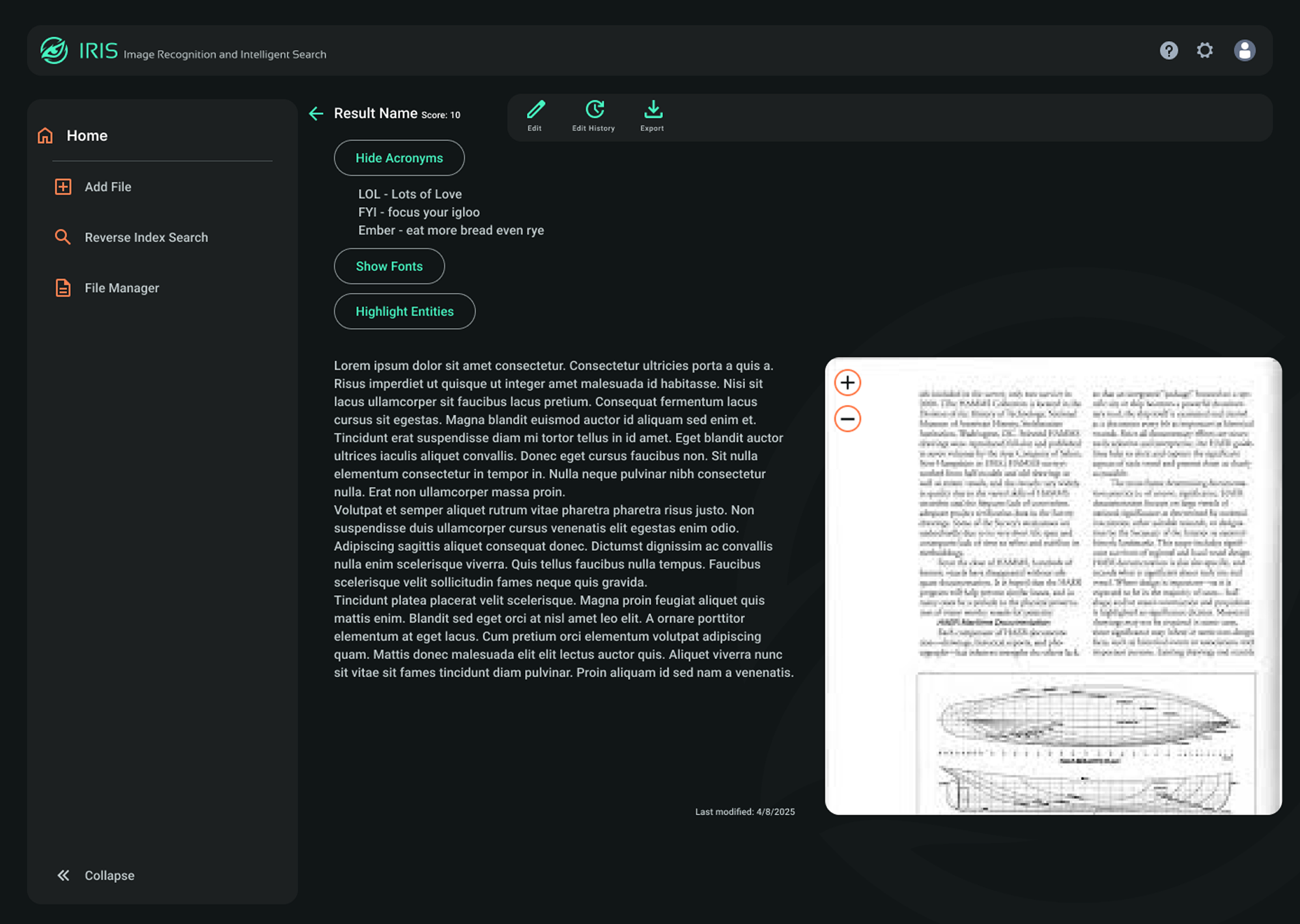
Here is another page of the IRIS application showing the OCR functionality of the app. In the process of making this app I had to condense and simplify the interface from the original mock up by the data scientist. This led to a easy to use app where the users can extract, view, compare, and edit text from a image.

The Space Use Management System (SUMS ,)app is an app solely created by myself from beginning to end. It's a useful tool to find where employees sit, the capability and assets of a workstation, and efficiently track the workspace to avoid overcrowding or unused space.

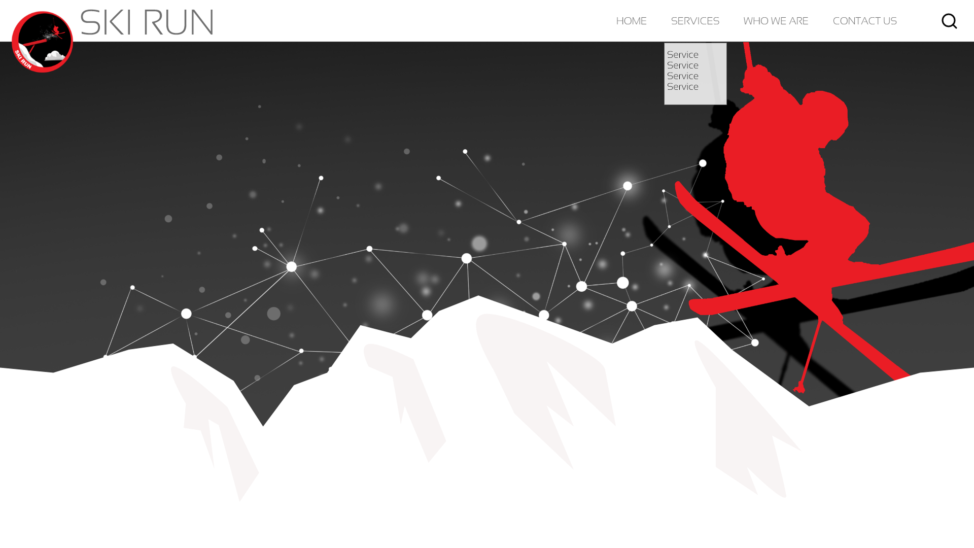
This is a Xd file of the SkiRun homepage. I enjoyed this project to create a front facing website of our teams capabilities. The transitions and parallax animations were a point of pride in the final mockup.

This landing page for PRISM was an example of a quick turn project. The team needed something flashy to demo in just a couple days so I mocked this up in one day utilizing many blend modes to make it stand out.