
Identity
Icons are the essence. They can make or break an entire team or project.
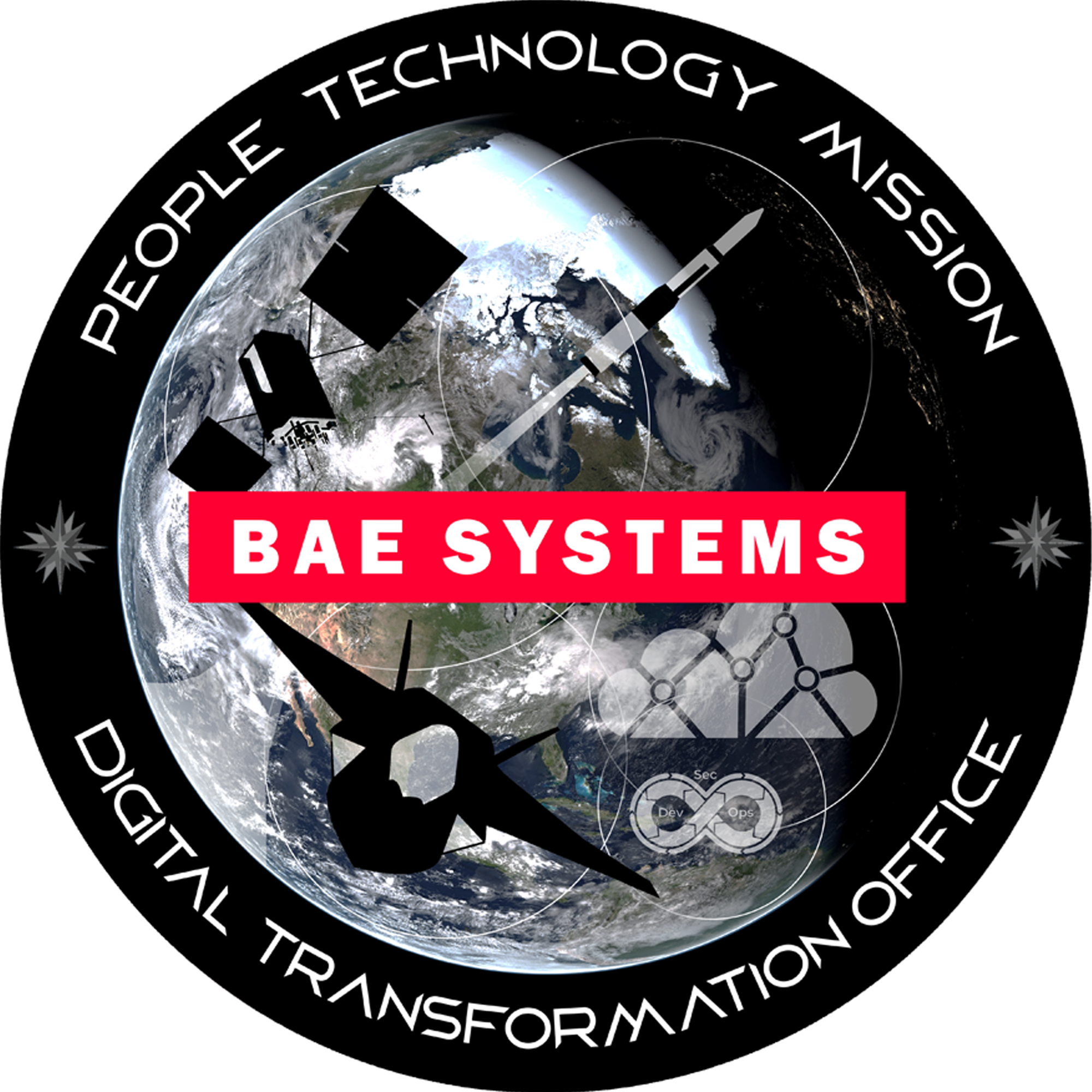
Here is the final logo I created for the Digital Transformation Office (our team). It is a good example of producing something that the customer loves (but I may not). I had clear direction in this project and the whole team loved the result.
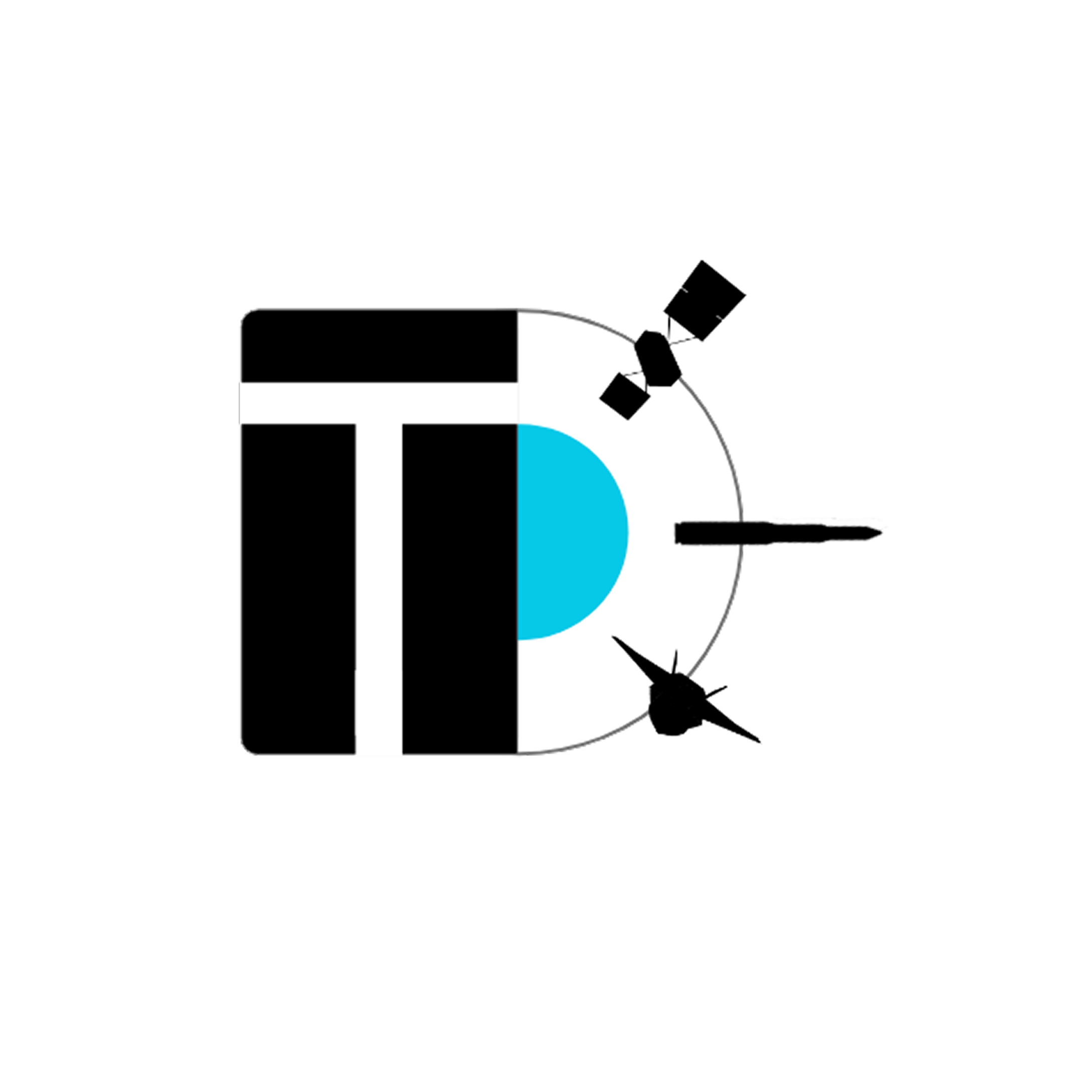
Here is a concept logo for the DTO. I prefer a more simple approach to logos, but I am happy to adjust to the need.

Here is the logo created for our GIS team. I added a lot of symbolism into this logo. For example, the topo lines in the background are actual topography of an area at Vandenberg SFB where test launches are held. This logo very much follows the style of military emblems.

This is an early logo that was for our team before the DTO. It shows the old technique of pen and ink on paper.

Here is a simple logo of one of our team's capabilities. The iconography is pretty clear, but the element of the yellow spark mimicking the path of a icbm missile was a great double meaning that the customer loved.